Exploring Nome’s Sea Ice with Satellite and Ground Radar
I recently found out about UAF’s sea-ice radar monitor at the end of the pier in Nome’s port.
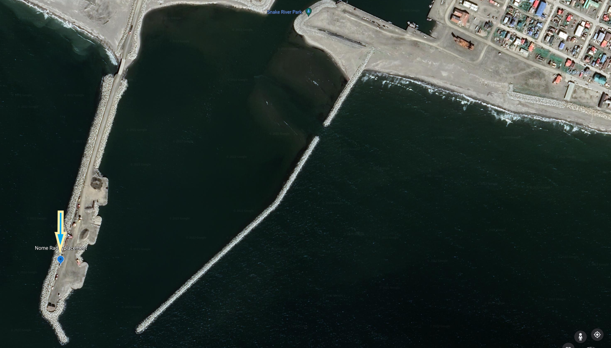
Location of radar in port of Nome. Image from here.
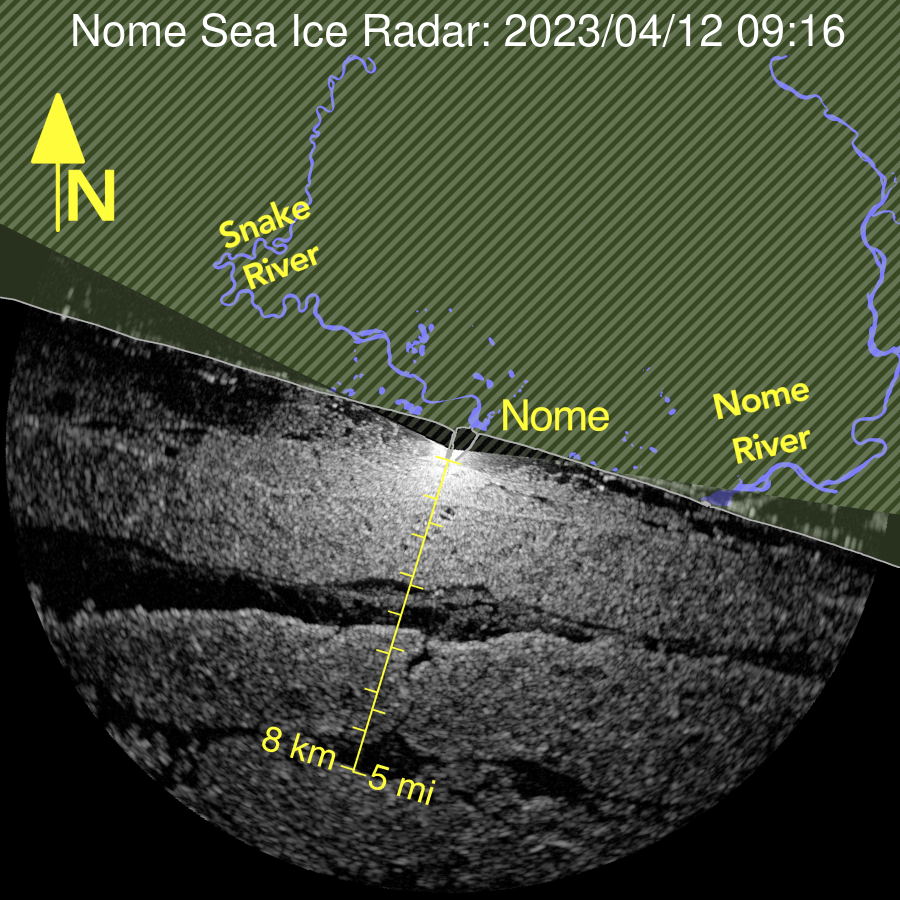
Latest radar image from the port.
Naturally, I wanted to investigate how this ground-based radar compares with satellite observations of recent sea ice conditions. Here’s what I found out.
Quick radar background
Radar sensors measure light (a.k.a. radiation) reflected off of surfaces. Just like a human eye; however the wavelength of radar used here is in the centimeter range, which is many many times longer than the visible light our eyes perceive in the nanometer range. In short, we can’t see these radar light waves, but the radar sensors can.
Essentially, these sensors emit radiation (a.k.a. light) at a specific frequency and measure the amount of light returned to the sensor. In general, smoother surfaces reflect more light away (like looking at a mirror from the side) and rougher surfaces reflect more light back towards the sensor.
The exact interaction of the light with sea ice and open water is more complex, but in general smoother surfaces like calm open water and smoother sea ice show up as darker in the radar image, whereas windy water, sea ice ridges, and a variety of other rougher surfaces from sea ice show up as lighter in the radar image.
BIG DISCLAIMER: The interpretation of sea ice from radar images is very difficult, and I am not an expert. Always use extreme caution when venturing out on the ice pack. This is an excellent guide to sea ice interpretation from radar, and here’s an image showing the general relationship and myriad complications of measuring sea ice extent and type from radar imagery:
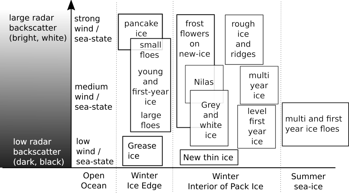
Image from here, based on modification of Johannessen et al. (1997)
The basic thing to keep in mind is:
- smoother = low radar backscatter = darker in radar image
- rougher = high radar backscatter = lighter in radar image
On to the good stuff
With that out of the way, let’s look at some pretty pictures.
What does it actually look like?
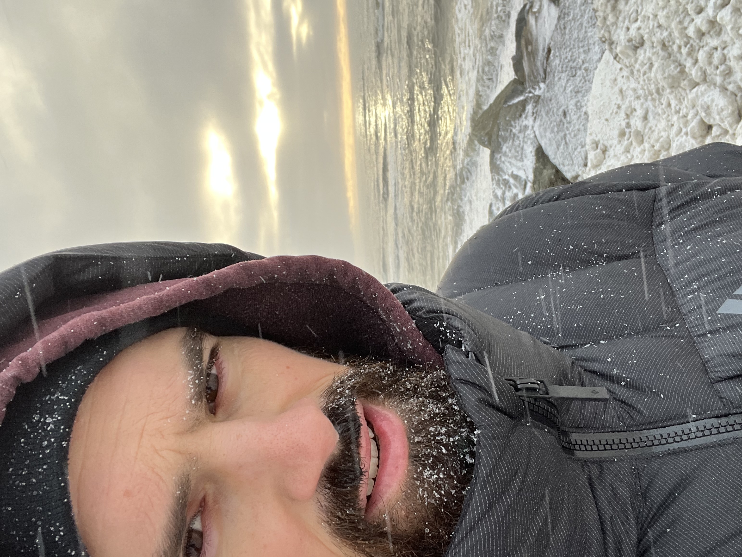
Before we get into the weird world of radar, how does it look with our own eyes on the coast off of Nome right now?
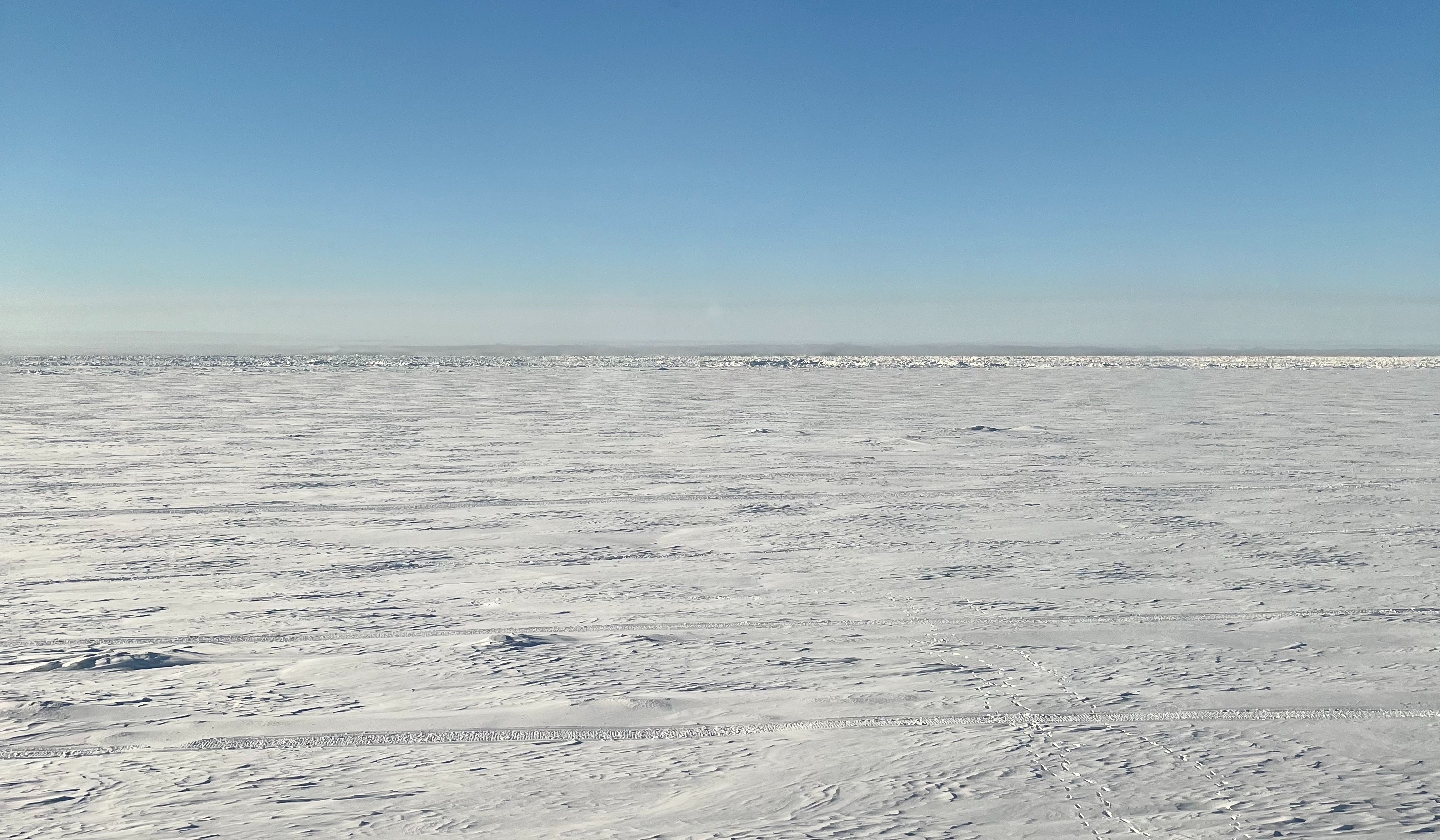
That’s a picture from today. You can see the relatively smoother, stable, older ice near-shore and then some ridges of rafted ice about one or two kilometers out in the distance.
Sentinel-1 Satellite Radar
The satellite data I want to check out is from the Sentinel-1 satellite pair. These are radar (technically a synthetic aperture radar, or SAR) satellites that have been up in orbit since 2015. The data is free to the public. Unfortunately, one of these pair was recently decommissioned, so rather than getting an image every day or two in the arctic, we only get one every four or five days.
Here’s a timelapse of sea ice from a few days when the satellite was passing over Nome in the past few weeks:
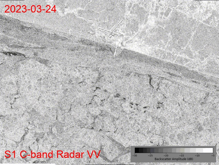
(I made the Sentinel timelapse images throughout this post using Google Earth Engine.)
For reference, the cross in the top center of the timelapse is the airport (each arm of the cross is a runway), and the town of Nome is the bright (white) patch just east of the airport. The Bering Sea is everything south of the east-west oriented coastline and the port is the white arm sticking out into the sea off of the coast.
And look! The runways are a smooth surface, and they appear dark in the radar image (low backscatter), whereas town is very rough (lots of buildings) and thus appears very light in the radar image (high backscatter).
If we keep in mind that general rule, then we can interpret the whiter pixels in the Bering Sea as rough sea ice. Although it could also be rough, windy seas, but the winds have not been especially strong these first few weeks of April. On the other hand, it has been very, very cold (record breaking for April in fact). So white = rough sea ice, and that makes the darker black pixels open water. Pixels in between black and white might be some of that smoother ice like we saw in my photo just off the coast.
Look how much it’s changing a few kilometers off of the coast in the two weeks shown in this timelapse! Neat! (And tread carefully out there.)
What about the other polarization?
Okay, true, I only showed the VV (vertical-vertical) polarized timelapse, but we can also look at the cross-polarized (vertical-horizontal, or VH) image from Sentinel-1. There are differences in the sea-ice interaction between these two modes of sensor operation, but in general the results are similar, showing near-shore consistent ice pack and a lot of movement nearby off shore:
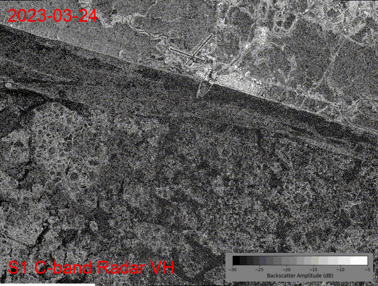
I also really like how the radar images show the smoother (darker pixels) on the land north of the coastline, where the tundra is covered in several meters of mostly smooth snow. The lighter pixels on the land are a mixture of human infrastructure (buildings, roads, mining operations) and natural, rough features occurring in river valleys (willows poking up through the snow).
Radar From Port
It looks like something happened between April 5th and 10th that dramatically changed the ice extent and opened up a large amount of open water a few kilometers off of the coast. Unfortunately, we only have a limited number of satellite scenes, so we can’t fill those gaps from the current data.
But, how do the ground-based port radar measurements represent this time period?
A couple of notes in comparison to the Sentinel-1 satellite: the ground based radar has a much higher spatial resolution (each pixel shows a smaller area), it has a much higher temporal resolution (the timelapse is composed of one image every four minutes), and the radar wavelength is shorter (by about half).
Regardless of these differences, the same general rule of darker = smoother and lighter = rougher hold for interpreting this video timelapse courtesy of UAF (Press the play button to watch it):
Sea ice radar timelapse from April 7th, 8th, 9th from here
Clearly in the early morning on April 8th, a big raft of ice broke off and began floating away, opening things up like we saw in the satellite! Thanks, port radar!
There are a lot of differences compared to the satellite imagery (also in the extent of coverage, where the ground measurement is only showing an eight kilometer radius from the pier), but clearly the data is complementary and show generally similar trends:
Nearby the shore we currently have pretty stable ice, but a few kilometers out we have frequent changes in the ice pack. Let’s see how long into the spring this ice lasts.
Hold up, why not optical images?
Radar is neat and all, but we also have a bunch of optical satellites orbiting the earth, like Landsat and Sentinel-2. Why not just use these easy-to-interpret pictures from space?
Well, in this case, we actually do have some nice Sentinel-2 imagery to corroborate the radar data (ice becoming open water):
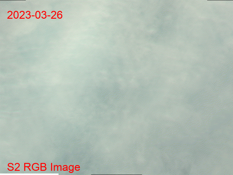
But, the first image in this timelapse from March 26th shows the issue with optical data: it doesn’t penetrate cloud cover. And cloudy days are pretty frequent, making it difficult to get the consistent measurement of sea ice that radar offers with its ability to “see through” any cloud cover.
